Retap

product, logo & name strategy

Water on new bottles

Designs selling around the world

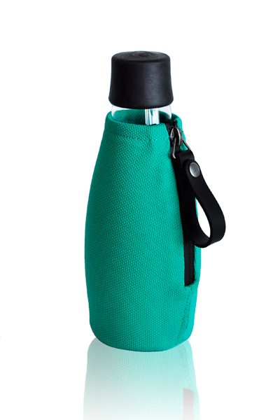
The company name Retap and the logo that tells the story of “re-filling” and “tap-water”. A simple, scalable and robust product in a simple idiom that is both comfortable to drink from, via a large, threadless opening, and cleaning-friendly. A bottle whose simplicity allows individualization in the form of company logo on lid and bottle, thereby supporting the company’s graphic identity
Retap Bottle 3PART
150.00
Users
6 months
pay-back time
+ 10
different countries

Taking the fight to single-use plastic

Retap was at the start of the task with a desire to develop a new product to replace the millions of plastic bottles that many later use as a drinking drink. These plastic bottles both pose a health risk while putting a strain on the environment. At the same time, the price of plastic bottled water is 1000 times higher than for tap water, which is healthy drinking water. The desire was therefore a 0.5 l. bottle that was easy to clean and produced in an environmentally friendly material. At the same time, the bottle had to have a personal and professional design, as the sales focus was initially the B2B market.

Workshop-based product development

01

Research

3PART conducted a thorough research within both the production area and the design of bottles. In this way, significant knowledge was gained about customers and stakeholders who in the future helped to fulfill Retap’s wishes and ultimately deliver a successful product.

Workshops

The purpose of the workshop was to provide retap with the knowledge of users and plastic bottles for 3PART. In addition, the focus was on possible solutions, the environment, value chains, the market and technology. All the material was subsequently used to prepare a design specification. 3PART was responsible for planning and facilitating the workshop.

02

03

Idea generation and development

On the basis of the research phase and the workshop, the sketchwork could begin. Different designs and their functionality in relation to cleaning, ease of use and production were tested, and name suggestions and logo sketches were produced based on the values that the bottle was to symbolize.

Stakeholder validation

Before the final concept was chosen, validation was held with the same people who were at the beginning of the project. The validation had a major impact on the design of the final expression.

04

Download the project here

To view the entire project with further details, you can download the entire project here.

3PART knows what design is all about

See more cases

Actuators – 360 degree design process

Need help too?

3PART logo
3PART is the experienced innovation partner who can develop the products and digital services that create additional turnover and value in your business in the future

best regards

Simon Skafdrup, 3PART A/S

Founding Partner & CEO Design Manager